Announcement

Collapse
No announcement yet.

Facepack Installed

Collapse
X
 
  • Filter
  • Time
  • Show
Clear All
new posts

  • #31
    Gimp is good. That's what I'm going to be using for my teams uniform.
    I'm glad to see that someone is using the face tool, I was going to test it myself, but I hadn't gotten around to it yet.
    Los Lunas Javelinas - 1978 Brewmaster Champions!

    Comment


    • #32
      Originally posted by JJLinn
      Yeah, I tried to go through that and I couldn't do anything with that in paint, but I did make a regular home uni in paint that you could convert to that player portrait. I'd appreciate it if you could do that.

      This uniform is turning out to be a bitch to make. The problems I'm having is I can't find a font that looks good. Also, the text on the uniform looks bad when I add a black border to it, but is hard to see on the white background without it.

      Comment


      • #33
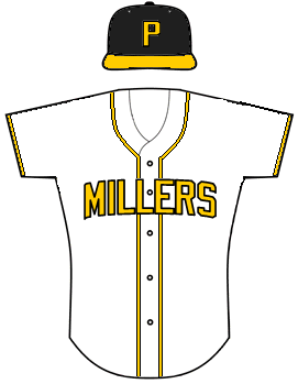
        Ok here is my 1st draft for Pittsburgh. I'm not very happy with it but wanted to see if I was on the right track before I put more work into it.


        Does anybody know of a better way to curve text using Gimp? I'm using the filter->distorts->curve bend option which really seems to pixelize the letters rather than making them smooth like in photoshop.

        Comment


        • #34
          are you curving TEXT or have you converted to vector grahics before modifying?

          Comment


          • #35
            It looks good, but maybe try a MLB/NFL block font for the wordmark on the jersey? The arch looks fine to me though.

            Comment


            • #36
              Originally posted by Wessinmouse
              are you curving TEXT or have you converted to vector grahics before modifying?
              Curving. What does "converted to vector graphics" mean, and would it work better? I'm a novice at this.

              Comment


              • #37
                Here's one I made for Syracuse:


                These are pretty easy to make so if anybody wants to try their own uniforms, feel free. You can DL the template from here: http://newrepublic.silvergriffin.com...mTemplates.zip

                Comment


                • #38
                  Originally posted by Andrew
                  Originally posted by Wessinmouse
                  are you curving TEXT or have you converted to vector grahics before modifying?
                  Curving. What does "converted to vector graphics" mean, and would it work better? I'm a novice at this.

                  if you're going to manipulate text, you want the software to recognize it as an image (or group of images) rather than text. Then it's the same as morphing or modifying a picture and the software will have a better handle on what you're trying to do and what result it should give you. Of course the downside is that you can't edit the text itself after converting it to vector or raster image.

                  Comment


                  • #39
                    Originally posted by JJLinn
                    It looks good, but maybe try a MLB/NFL block font for the wordmark on the jersey? The arch looks fine to me though.
                    Ok I made some slight changes to the jersey text using Wessinmouse's suggestions. I think it looks a little bit better. I still can't find a font I like for the cap though. I can't find a good block letter font.

                    Comment


                    • #40
                      search on fonts and collegiate. There're plenty of free downloadable fonts that'll look great on there.

                      Comment


                      • #41
                        It looks good, thanks!

                        Comment


                        • #42
                          Virginia Colonials:


                          EDIT - Updated Colonials.

                          Comment


                          • #43
                            So we're in a softball league?

                            Comment


                            • #44
                              Wilmington:

                              Comment


                              • #45
                                sweet.

                                why is everybody changing their logo?

                                Comment

                                Working...
                                X